Skills & Tools
- Front End Development
- User Experience
- UI Design
Client
- Prudential
Overview
PGIM, Inc. is the asset management arm of American life insurance company Prudential Financial. With more than $1 trillion in assets across several autonomous businesses, PGIM needed a modern system that could scale with their publishing needs across multiple channels.


Overview
Site Structure
This new site’s basic architecture was composed of two main pieces – a Drupal backend that provided apis and services for data consumption and a front end Angular app the consumed data and rendered rich, modular pages of content for the end user. But the site was more than just a standard decoupled website, which is quickly becoming the norm for larger web apps and multi-channel platforms. By using a shared set of code and components, the front end could render content from any of PGIM’s autonomous businesses while still retaining the unique brand attributes for that business.

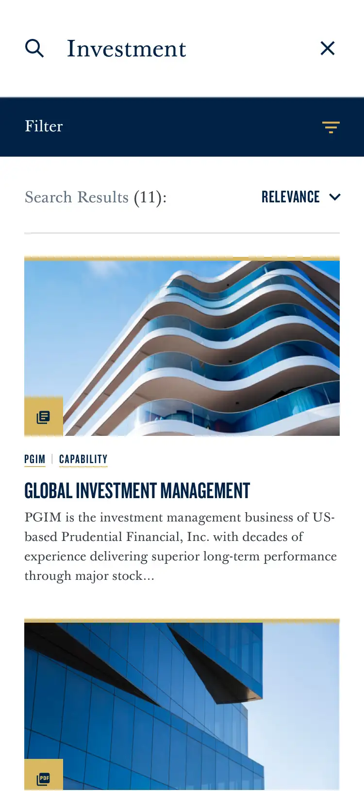
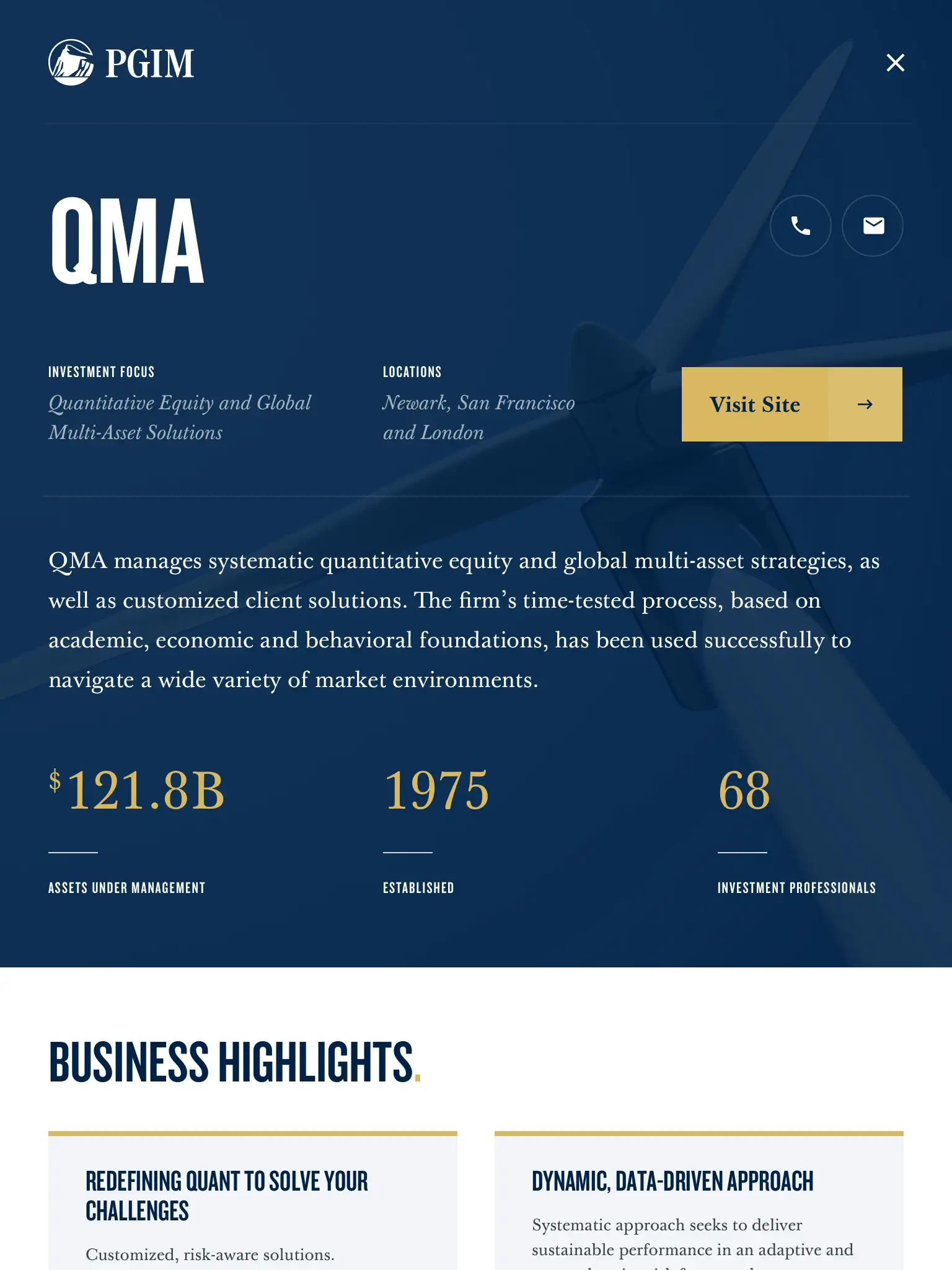
My role was devoted to several aspects of developing the front end user experience: designing and building modular components that were used to render various types of content for pages within the site, enabling sophisticated search functionality that allowed users to search for content across PGIM’s family of websites, and ensuring that Angular routing provided seamless transitions and navigation between various types of content.

Front End Architecture
In order to provide engaging and customized pages for the site, our new front end architecture had to process json response data that was sent from the back end using the https://jsonapi.org/ json:api specification. This json data was then visually represented on the site using a series of presentational components. In order to build modular components on the front end, our team used an indispensable tool called Storybook that was set up as a separate Angular app and contained an entire library of components. Storybook served as an isolated component building tool and area for experimentation that lived outside of our app. Within Storybook, we built components and used Storybook’s tools to allow them to display all the potential types of data that they would get back from the Drupal api.


Because of Angular’s built in CSS scoping and straightforward integration with SCSS, we were able to style these components easily without any concern about namespace issues or complex tooling. These components were built in a bottom up fashion with base level components made up of things like image formats, type styles, and grids integrated into more complex components like tabbed navigation, sign up forms, and content packages displaying multiple articles.

Component Structure
These stateless “presentational” components would then be integrated with stateful components that received data from the Drupal api or our global data store managed with NGRX. Each of the components was tested rigorously across responsive sizes, browsers, and to ensure A11y compliance.

By using Storybook for building components, the base Angular app architecture was greatly simplified because it was only concerned with services, routing, and state. Within our Angular app, we used NGRX to manage global state. This included built in Angular data like the routing history as well as cached page data and global brand data that was loaded on initial request to the Drupal API.
Permissioning System
Attestation Modal
Additionally, since the site had a fairly complex permissioning system on a page by page basis, we stored information about the user’s location and role, which determined which pages in the site they were allowed to visit based on various roles selected for them.

Attestation Modal

We created a robust set of text styles that could be accessed by scss mixins. Each typography setting had a size for mobile, tablet, and desktop screens. If I were to rebuild today, I would lean into CSS's newer features like viewport units and clamp.
Conclusion
Through the use of a system for setting up components and integrating them within the main Angular app, we are able to set up the PGIM team with a rock solid site that could be extended and built upon for whatever needs they may have in the future.